Are you looking good data visualization tools to transform your complex data into meaningful insights? Look no further! In this blog post, we will explore the best data visualization software available in the market. Data visualization is a critical component for businesses to analyze and interpret their data, allowing them to make informed decisions and drive growth.
Best Data Visualization Software List
Discover more data visualization tools at Serchen’s Data Visualization Marketplace.
What is Data Visualization Software?
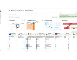
Data visualization software is a type of application that enables users to represent complex data sets in a visual format, such as charts, graphs, and maps. These tools help users identify patterns, trends, and correlations within the data, making it easier to understand and interpret. The accuracy and completeness of the information presented are crucial in ensuring that the data visualizations can provide actionable insights.

Benefits of Data Visualization Software
Enhanced Data Comprehension
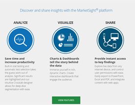
Data visualization software simplifies complex data sets, making it easier for users to grasp the information and draw insights. By presenting data in a visually appealing format, users can quickly identify patterns, trends, and anomalies in import data, leading to more informed decision-making.
Time and Resource Efficiency
Visualizing data saves time and resources by enabling users to quickly analyze large volumes of data. This efficiency allows businesses to identify potential issues or opportunities more rapidly, leading to faster decision-making and improved outcomes.
Improved Communication and Collaboration
Data visualization software enables teams to share insights and collaborate more effectively. By using data visualisation tools presenting information in a clear and concise manner, team members can quickly understand the data and contribute to discussions, resulting in better decision-making.

Data Visualization Software Key Features
Drag-and-Drop Interface
A user-friendly drag-and-drop interface allows users to create visualizations quickly and efficiently, without the need for extensive coding knowledge. data formats
Customizable Visualizations
Data visualization software should offer a wide range of customizable visualization options, including bar charts, pie charts, and line graphs, charts, and more. This flexibility allows users to choose the most appropriate visualization type for their specific data set and business needs.
Data Integration
Effective data visualization tools should integrate seamlessly with various data sources, including databases, spreadsheets, and cloud storage services. This integration allows users to access and visualize data from multiple sources, providing a more comprehensive view of their business.

Factors to Consider When Choosing Data Visualization Software
Scalability
As your business grows, your data visualization needs may expand as well. Consider software that can scale to accommodate larger data sets and more users.
Customization and Flexibility
Choose a data visualization tool that offers a wide range of customization options and flexibility to create data visualizations tailored to your specific business needs.
Security and Compliance
Ensure that the software you choose adheres to industry security standards and complies with relevant data privacy regulations.

Data Visualization Software Use Case Examples
Retail businesses can use data visualization software to analyze sales data, identify trends, and optimize inventory management.
Healthcare organizations can visualize patient data to track health outcomes, identify potential risks, and improve patient care.
Financial institutions can use data visualization tools to analyze market trends and make more informed investment decisions.
Manufacturing companies can visualize production data to identify bottlenecks, optimize processes, and improve efficiency.
Marketing agencies can use data visualization software to analyze campaign performance data, identify trends, and optimize marketing strategies.

Potential Data Visualization Software Problems
Overwhelming Visualizations
Presenting too much data in a single visualization can lead to confusion and misinterpretation. Ensure that the visualizations are clear and focused on specific insights.
Misleading Visualizations
Poorly designed visualizations can misrepresent data, leading to incorrect conclusions. Choose a software that promotes best practices in data visualization design.
Limited Customization
Some data visualization tools may not offer enough customization options, limiting the ability to create visualizations that accurately represent your data and business needs.
Data Visualization Software Costs
Data visualization software costs can vary depending on factors such as the number of users, data storage requirements, and additional features. Some tools offer free or low-cost options for smaller businesses, while enterprise-level solutions may require more significant investments. Additionally, consider the time and resources needed for training and implementation.
Current Data Visualization Software Trends
Current trends in data visualization software include the integration of artificial intelligence and machine learning capabilities into visual representation, the rise of real-time data visualization, and the increasing focus on mobile-friendly and interactive visualizations.

How We Choose The Best Data Visualization Software
Selecting the right data visualization software for your organization can significantly impact the insights you gain from your data and overall business growth. With a variety of options available in the market, it can be challenging to choose the best one for your needs.
To simplify the decision-making process, we’ve conducted extensive research and analysis to identify the top data visualization tools and software companies in the industry.
Our methodology for selecting the best data visualization tools and software vendors is based on several key factors. First, we considered the functionality and features offered by each software, including visualization types, customization options, data integration capabilities, and ease of use.
Second, we evaluated the user interface and scalability, as well as the level of customization and integration with other business systems such as data storage, project management, and communication tools.
We analyzed customer reviews and feedback on Serchen, as well as G2, and Trustpilot, to gauge user satisfaction and the level of support provided by each vendor. Additionally, we took into account the pricing and affordability of each solution, as well as the level of customer service and support offered.
By considering these factors, we’ve identified the top data visualization software vendors that offer the most comprehensive, user-friendly, and cost-effective solutions for organizations looking to unlock the power of their data.
Top 5 Data Visualization Software Providers
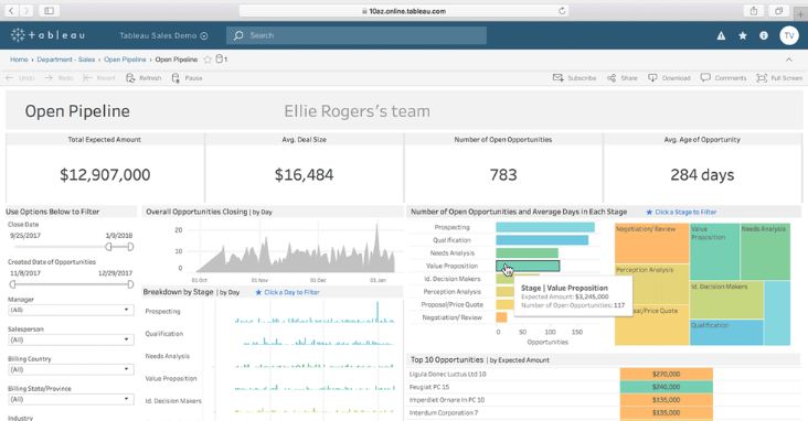
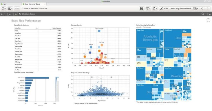
Tableau
Year Founded: 2003
Tableau is a leading data visualization software that enables users to mine data source create interactive and shareable visualizations with a user-friendly drag-and-drop interface.
Features:
Wide range of visualization types
Drag-and-drop interface
Data integration with various sources
Customizable dashboards
Collaboration and sharing tools
Pros:
Highly intuitive and easy to use
Extensive customization options
Strong community support
Cons:
May be expensive for smaller businesses
Limited advanced analytics capabilities
Support Available:
Online resources and documentation
Community forums
Email and phone support
Best suited to:
Businesses of all sizes
Users with limited technical expertise
Pricing from:
Free version available (Tableau Public)
Paid plans start at $70 per user per month
Ave Rating on: (Serchen, G2, Capterra, Trustpilot):
Aggregate score: 4.3/5
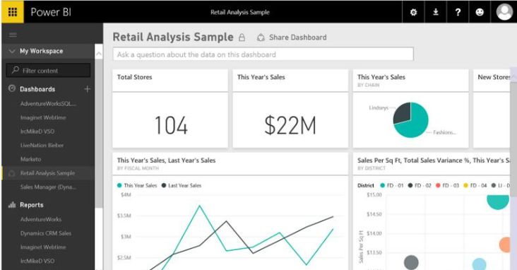
Power BI
Year Founded: 2014
Power BI is a data visualization and business analytics tool from Microsoft, allowing users to create interactive charts, visualizations and reports with seamless integration with other Microsoft products.
Features:
Drag-and-drop interface
Integration with Microsoft products and other data sources
Customizable visualizations
Data modeling capabilities
Real-time data visualization
Pros:
Affordable pricing options
Seamless integration with Microsoft products
Strong community support
Cons:
Limited customization options compared to competitors
Steeper learning curve for non-Microsoft users
Support Available:
Online resources and documentation
Community forums
Email and phone support
Best suited to:
Small to medium-sized businesses
Organizations already using Microsoft products
Pricing from:
Free version available (Power BI Desktop)
Paid plans start at $9.99 per user per month
Ave Rating on: (Serchen, G2, Capterra, Trustpilot):
Aggregate score: 4.2/5
QlikView
Year Founded: 1993
QlikView is a business intelligence and data visualization platform that offers powerful data analysis and visualization features with a unique associative data model.
Features:
Associative data model
Wide range of visualization options
Customizable dashboards
Data integration capabilities
Collaboration and sharing tools
Pros:
Fast data processing
Unique approach to data exploration
Robust analytics capabilities
Cons:
Steeper learning curve compared to competitors
May require IT support for complex implementations
Support Available:
Online resources and documentation
Community forums
Email and phone support
Best suited to:
Medium to large-sized businesses
Users with some technical expertise
Pricing from:
Qlik offers a free version of QlikView for personal use
Ave Rating on: (Serchen, G2, Capterra, Trustpilot):
Aggregate score: 4.1/5
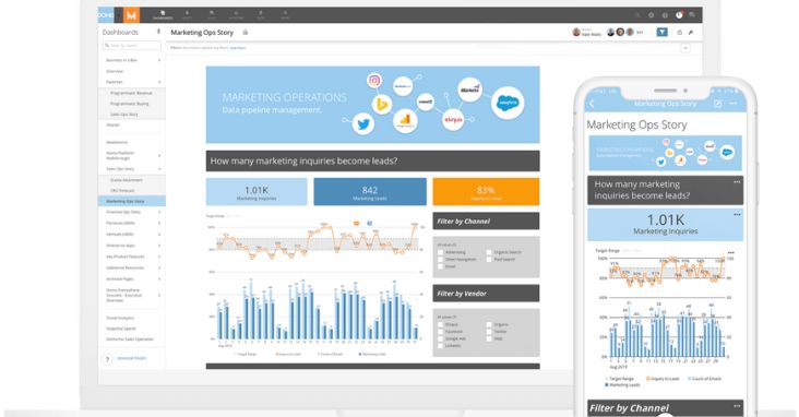
Domo
Year Founded: 2010
Domo is a cloud-based data visualization and business intelligence analytics platform that enables users to connect, analyze, and visualize data from various sources in real-time.
Features:
Cloud-based platform
Real-time data visualization
Integration with numerous data sources
Customizable dashboards
Collaboration and sharing tools
Pros:
Easy-to-use interface
Real-time data visualization capabilities
Strong mobile functionality
Cons:
Limited advanced analytics features
Can be expensive for smaller businesses
Support Available:
Online resources and documentation
Community forums
Email and phone support
Best suited to:
Small to medium-sized businesses
Users looking for real-time data visualization
Pricing from:
Domo offers a free trial and is then ranges from $83 per user
Ave Rating on: (Serchen, G2, Capterra, Trustpilot):
Aggregate score: 4.0/5
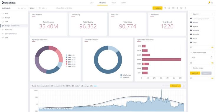
Sisense
Year Founded: 2004
Sisense is a data analytics and visualization platform that offers powerful data analysis, various data visualization techniques, and reporting capabilities, with a focus on scalability and ease of use.
Features:
Drag-and-drop interface
Wide range of visualization options
Data integration capabilities
Customizable dashboards
Embedded analytics
Pros:
Highly scalable platform
Intuitive interface and ease of use
Robust embedded analytics features
Cons:
Limited data modeling options
Can be expensive for smaller businesses
Support Available:
Online resources and documentation
Community forums
Email and phone support
Best suited to:
Medium to large-sized businesses
Users seeking a scalable solution
Pricing from:
Sisense also offers a fully functional free trial, then prices start from $83 per user/month
Ave Rating on: (Serchen, G2, Capterra, Trustpilot):
Aggregate score: 4.2/5

Data Visualization Software FAQ
What is data visualization software?
Data visualization software enables users to represent complex data sets visually, making it easier to analyze, understand, and communicate insights.
Why is data visualization important?
Data visualization helps users identify patterns, trends, and correlations in data, enabling more informed decision-making and effective communication of insights.
What types of visualizations can be created with data visualization software?
Common visualization types include bar charts, line charts, pie charts, scatter plots, heat maps, and geographic maps.
What factors should I consider when choosing data visualization software?
Consider factors such as ease of use, customization options, data integration capabilities, scalability, pricing, and support.
Can I integrate data visualization software with other business tools?
Most data visualization tools can integrate with various data sources, such as databases, spreadsheets, and APIs, as well as other business tools like CRM, ERP, and project management software.
Is there free data visualization software available?
Yes, there are free data visualization tools available, such as Tableau Public, Power BI Desktop and Google charts. However, these options may have limitations compared to paid versions.
How do the best data visualization tools handle data security and privacy?
Data visualization tools typically offer various security features, such as encryption, access controls, and data anonymization. Always review a vendor’s security policies and practices before making a decision.
Can I create mobile-friendly visualizations with data visualization software?
Many data visualization tools offer mobile-friendly features and responsive design options, making it easier to access and share visualizations on mobile devices.
What is real-time data visualization?
Real-time data visualization refers to the process of visualizing data as it is updated, allowing users to monitor and analyze data in real-time.
How can a data visualization tool benefit my business?
Data visualization software can help businesses make data-driven decisions, improve collaboration, identify trends and patterns, and communicate insights effectively.
Honorable Mentions
Other tools and big players in the field who also deseve a mention here are Zoho Analytics, Looker, Google Data Studio, Plotly and Datawrapper.
For even more choices, explore the category page on Serchen.

Data Visualization Tips and Practices
Choose the right visualization type
Select a visualization type that best represents your data and intended insights.
Keep it simple
Avoid clutter and prioritize clarity and simplicity in your visualizations.
Use color effectively
Use color to highlight key data points, establish hierarchy, and guide the viewer’s attention.
Tell a story
Use visualizations to communicate a compelling narrative that resonates with your audience.
Test and iterate
Continuously test your visualizations with different audiences to ensure they effectively communicate the intended insights.

Conclusion
Data visualization software can unlock valuable insights and improve decision-making for businesses across various industries. When choosing the very best data visualization tool solution for your organization, consider factors such as ease of use, customization options, data integration capabilities, and pricing. Don’t forget to explore complementary software, such as data storage and project management tools, which can be found on serchen.com.